Complex Contact Information for a Multi-Region Company
The History
A contact page had existed for several years on the now out-of-date Ektron CMS platform. We had been running a website on WordPress and Ektron simultaneously using a reverse proxy to make any pages still in Ektron appear to be part of the same URL. If you loaded up the SAI Global homepage and clicked on the contact us button you would be taken to the old website but your browser would continue to show the same domain.
The issue was that Ektron CMS was being sunsetted by it’s owner and we had limited time in which to migrate all our functions to a wordpress site.
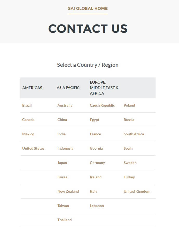
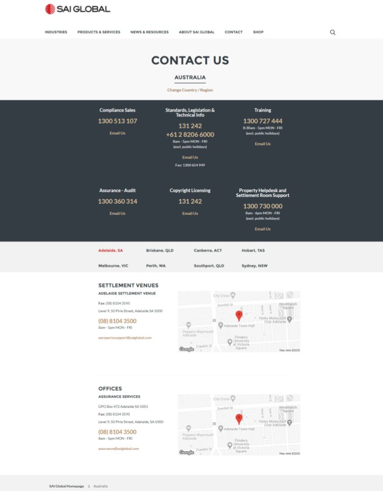
The contact page was built to accommodate the vastly complex business requirements of SAI Global. Each country that SAI Global operated in had a page within the contact section, each page had two sections; the contact numbers and email addresses for the country overall and then another section showing numbers for specific departments within that country. Due to the company being a built through acquisitions many of the numbers and emails addresses were not able to be placed in specific categories.
To exacerbate things all these factors were then split up by language for each region.
The user would click ‘contact us’ then they would have to choose their region and be taken to a new page where they could locate the number they needed based on either their city or their need.
This was the most complex contact page I had ever and have ever seen.
Requirement Notes
- All regions and all languages had to be supported
- Discovery needed to be completed to ensure that the numbers were all correct and were still connected
- The new design had to simplify the contact process
- The data needed to be centrally located.
- We needed to simplify the difference between open hours for phone lines and office hours when different and then adjust for time-zones where necessary.
- The build had to accommodate for a non-technical person to manage the data in the back-end in the future. We couldn’t leave any coding requirements for future stakeholders.
Research Findings
I began looking at other large companies’ contact pages to see how they had dealt with such cumbersome data. I looked at our competitors as well as other large global companies with the hope of finding a better solution.
Unfortunately there were no companies with contact information in quite such a complex formation so we had to do this the old fashioned way.
Early Designs
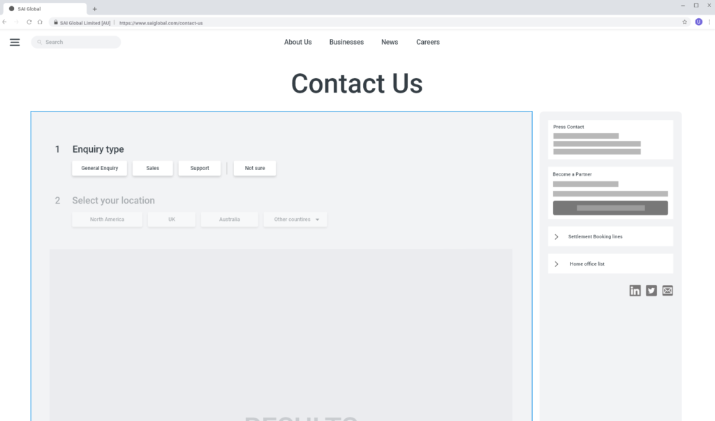
Initially we relied heavily on a choose-your-own-adventure style scenario. We quickly discovered this was not the answer. We were giving the user too many options and risking too much cognitive load and also the data just wouldn’t fit in this model.
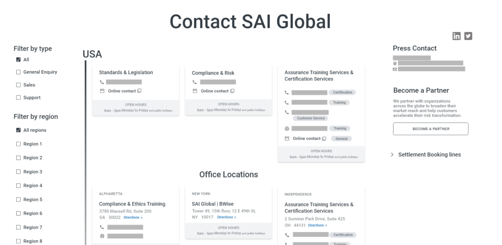
We landed on a similar concept being used before but with some very important alterations.
Final Designs
After many design iterations we were finally able to land on a concept which solved all our issues.
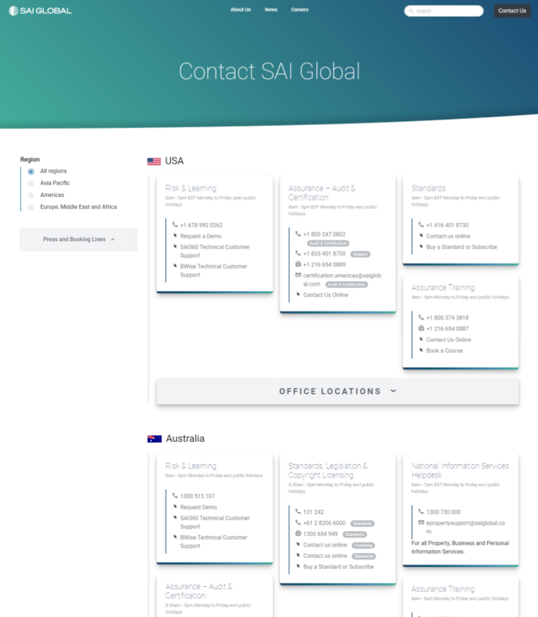
- Reduce the language variations English and the region variant. eg. the Spain phone numbers would be available in English and Spanish but not Turkish anymore. The work required to support a possible audience of zero was decidedly not worth it.
- The non-conforming contact information would be relegated to a sidebar. The sidebar became the location to find some of our most important numbers as well as master numbers or and email addresses needed by all regions and language such as the press contact information.
- Maintain the split by country but show all countries in a single page. The stakeholders made it clear that the 3 main regions should be at the top of the page and the rest of the regions would be listed alphabetically below. User testing showed this to be counterintuitive but you have to keep the stakeholders happy. To solve this we added a filter to the sidebar where a user could narrow the region by continent.
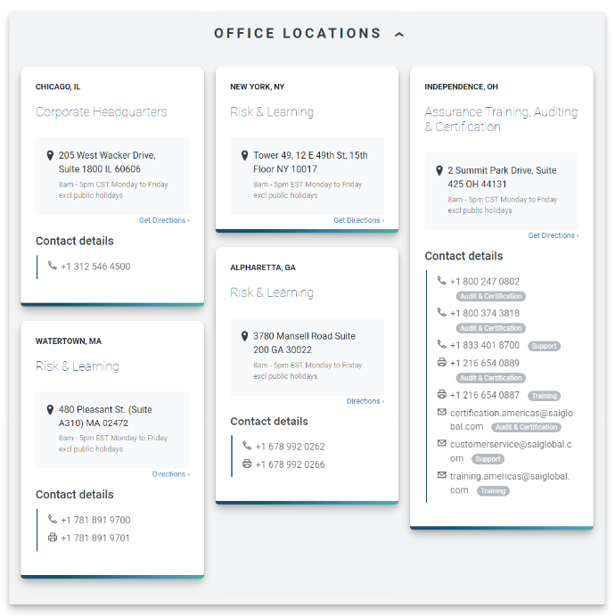
- We designed 2 card styles; one for country specific contact information split up by business type and another for office information. We called them Contact Cards and Office Cards.
- Any number or email address had an optional pill that could be added to the end as a label. It could say anything and there could be more than one. This meant we no longer had issues where two numbers for ‘Risk’ seemed out of place. Now we could add a “Risk Sales” and a “Risk Support” number.
- To simplify the design we moved all Office cards into a dropdown available at a click.

The Build
Tools Used:
- ACF Pro
- WordPress
- Custom Post Types UI
Process
- I created a new custom post type called ‘Countries’
- I created a new page template which looped through that custom post type
- Using ACF Pro I created a new item called ‘Country’ with the fields
ID,Country Name,Repeater Field: Contact Card,Repeater Field: Office Card - Using those fields I was able to create a back-end location for any user to add in and edit the contact data.
- We entered the data using those fields while I concurrently built out the template to show the data.
When the page was ready we were able to simply publish it on the WordPress CMS and tell the IT team to remove the reverse proxy for the list of contact pages on Ektron. We then redirected all the country contact pages over to our new single page.
Thankful
After having completed such an arduous task I’m fairly thankful that I likely won’t have such a complex contact page ever again. I do, however, still look at companies contact pages just to see what I could have done differently.
Next article ⚡ Making the Leadership Shine in a Leadership Page